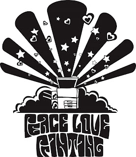
Here’s a t-shirt design that was scrapped this morning. 
Apparently I went too 70’s on them. Personally, I liked it a lot- 70’s? Groovy! I had worked a long time on the lettering so it’d be kind of readable but still very much shapes. They didn’t like it. Gah. Apparently they wanted more retro…. less graphic… more clip art. My new directive simply states: Peace (underneath a peace sign), Love (under a heart), Printing (under a copy machine) How boring.