Dealing with dynamic text can be particularly troublesome for designers especially when there is no min/max length. Truncation is nice for large amounts of text but doesn’t apply to inline elements that scale nicely for small amounts. Well, proof of concept time.
Play with the sample code
So, as a web developer, have you ever been asked to add a text bubble to your page?
No problem. Super lazy way would be to cut a background image. A better, less lazy way would be to add a little border-radius here, and and some padding and you’re done.
Did your designer ask for the width of the bubble to be dependent on the dynamic text?
Sure, put the background color on a span so that width is based on the text.
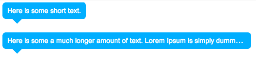
Oh, did she mention that the text needs to also truncate nicely when it becomes longer than the content area?
… shit.
The trick here is the have two nested elements. One inline, and one block.
- inline elements (like spans) get their width based on the content. Thus add the background color to the inline element.
- block elements (like divs) have a fixed width and thus can also have overflow properties.
A few things to note
- Need to hide the overflow and set the ellipsis for the text. (Line 6)
overflow: hidden;
text-overflow: ellipsis; - Need to prevent line wrapping. (line 17)
white-space: nowrap; - Need to add the same border radius on both containers. This way the border is applied when both short and when cropped long.
- The pointy is a css pointy as shown here.