Here is a simple way to get a letterpress effect in Photoshop CS3 and above.
To summarize, you apply a bevel and emboss layer style to the area around the ‘imprinted’ art. For this tutorial, I will show how to make the effect and then use smart objects to warp it non-destructively.
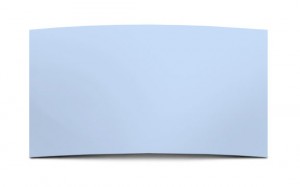
- Here’s my background card that I want to ‘letterpress’.
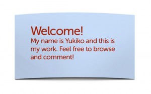
- Create the art/text that will be imprinted
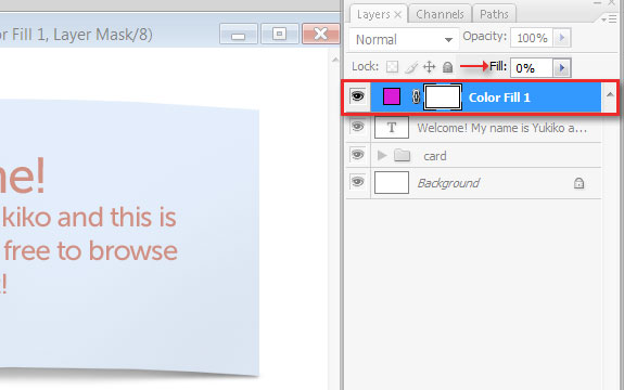
- Create a color fill layer. Set fill to 0.
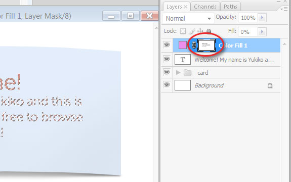
- Mask out the area of the art layer. To do this, create a selection of the art by CTRL + clicking the layer in the layers pallete. Now select the Color fill’s layer mask fill the selection with black.
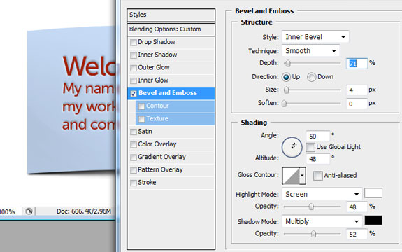
- Add a ‘Bevel and emboss’ layer style to the color fill layer. Set the direction to ‘Up’ and adjust the depth, size, and opacity of the emboss style. (Press ok) These settings will change depending on the size of your document, but here’s a screenshot to start you off.
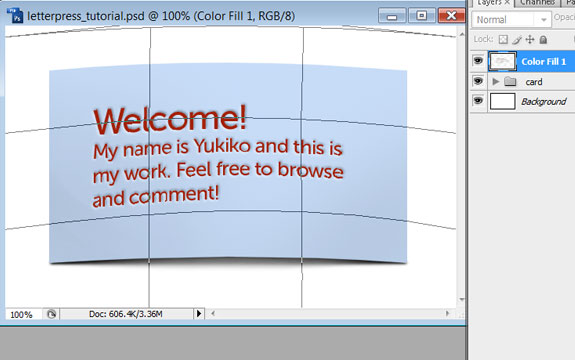
- To warp non-destructively, create a smart object from the art and fill layer. To do this, select both the art and fill layer, right-click and select ‘Convert to Smart Object’. Now you can free-transform the smart-object and/or also warp it.
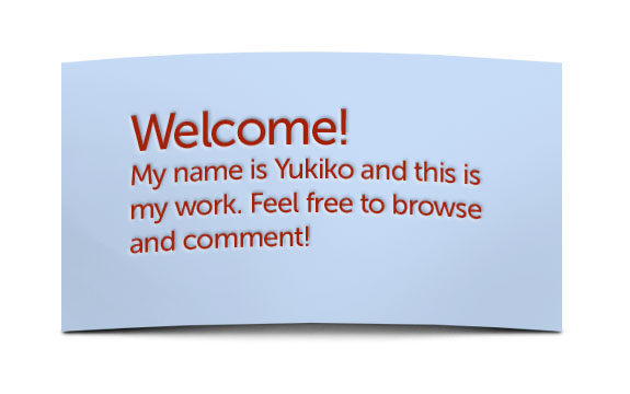
- Complete!
Afterword:
You can change the art color afterwards without affecting the letterpress effect since it’s on the fill layer. However, if you change shape of the art then you will have to recreate the mask. Not too much work though right? If you have complicated art, I would suggest creating a smart object of just the art for easy selection. (Just one click as opposed to going through selecting layer-by-layer) Enjoy!
Excellent post. Keep writing such kind of information on your site.
Im really impressed by your site.
Hi there, You have performed an incredible job. I’ll
definitely digg it and individually recommend to my friends.
I am sure they will be benefited from this website.
Also visit my web blog; search engine optimization – google.com
–
Hello! This is a very helpful tutorial. But I did not understand how to mask the letters in Step 4. Do you mind explaining it in another way?
Really good! I agree with Las Vegas Weddings. More original than most tutorials on the web.
This looks more like real letterpress then most of the other more popular tutorials out there. This actually looks like pressed paper. Thank You !
Worst tutorial ever. The letters don’t look anything like “letterpress” Looks like something made is MS paint.
This technique is meant to slightly deboss the letters to simulate the sponginess of the paper and not create the hard edges found on a cutout. And thanks for the positive comment btw.